

Creative & Brand
Carrying Each Production Across Every Printed Format
Theater print design carries a production off the stage and into everything an audience sees before the show. For Pregones/PRTT, every production in the season meant a new set of pieces, from direct mail and newspaper ads to posters, large-format venue graphics, and QR-coded materials, each with its own sizes, specs, and deadlines. Over a season, that added up to dozens of assets, all needing to look like they came from the same theater. The opportunity was to carry each production’s look into every piece without slowing down or dropping quality.
Every production came with its own artwork, created by the show’s designer. We worked from that artwork and adapted it across all the print, fitting each piece to its format while keeping the original design intact, so it held up whether it ran as a poster, a mailer, a newspaper ad, a venue graphic, a storefront window, or a season brochure. Production after production, that theater print design kept Pregones/PRTT’s look consistent from the stage to every printed piece, and gave the theater a professional, put-together presence across its marketing.
Pregones Puerto Rican Traveling Theater
Performing Arts & Nonprofit Theater
Print Design,
Advertising Design,
Large Format Graphics,
Production Artwork Adaptation
Every Pregones/PRTT production starts with its own artwork. The opportunity was to build a show’s full run of theater print design around that artwork, so each production looked consistent everywhere it appeared, from a mailer to a newspaper ad to graphics on the theater itself.
The theater print design work spanned a lot of formats, each with its own sizes, print specs, and deadlines: direct mail, newspaper ads, posters, large-format venue graphics, storefront window graphics, and season brochures. The job was to adapt each production’s original artwork to all of them without losing what made it work, so every piece looked like it came from the same show.
Over a full season, that kept the theater’s print consistent and professional. Each production held together across every piece, and the marketing matched the quality of the work on stage.
Our approach to the theater print design started with each production’s existing artwork. We adapted that artwork to each print format, kept it consistent across all of them, and produced the full range of print a production needed. We also built QR codes into the pieces, so the print could point people to tickets and information and so response could be tracked.
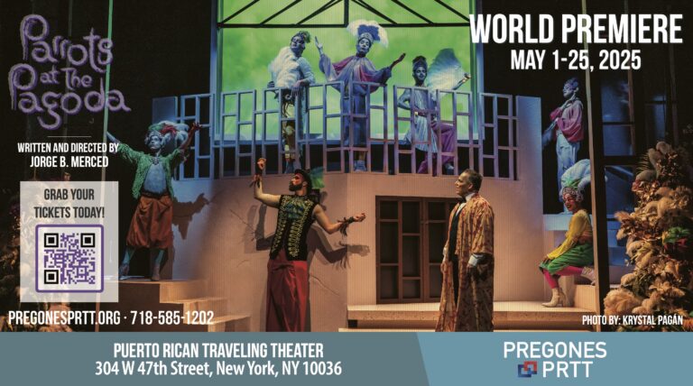
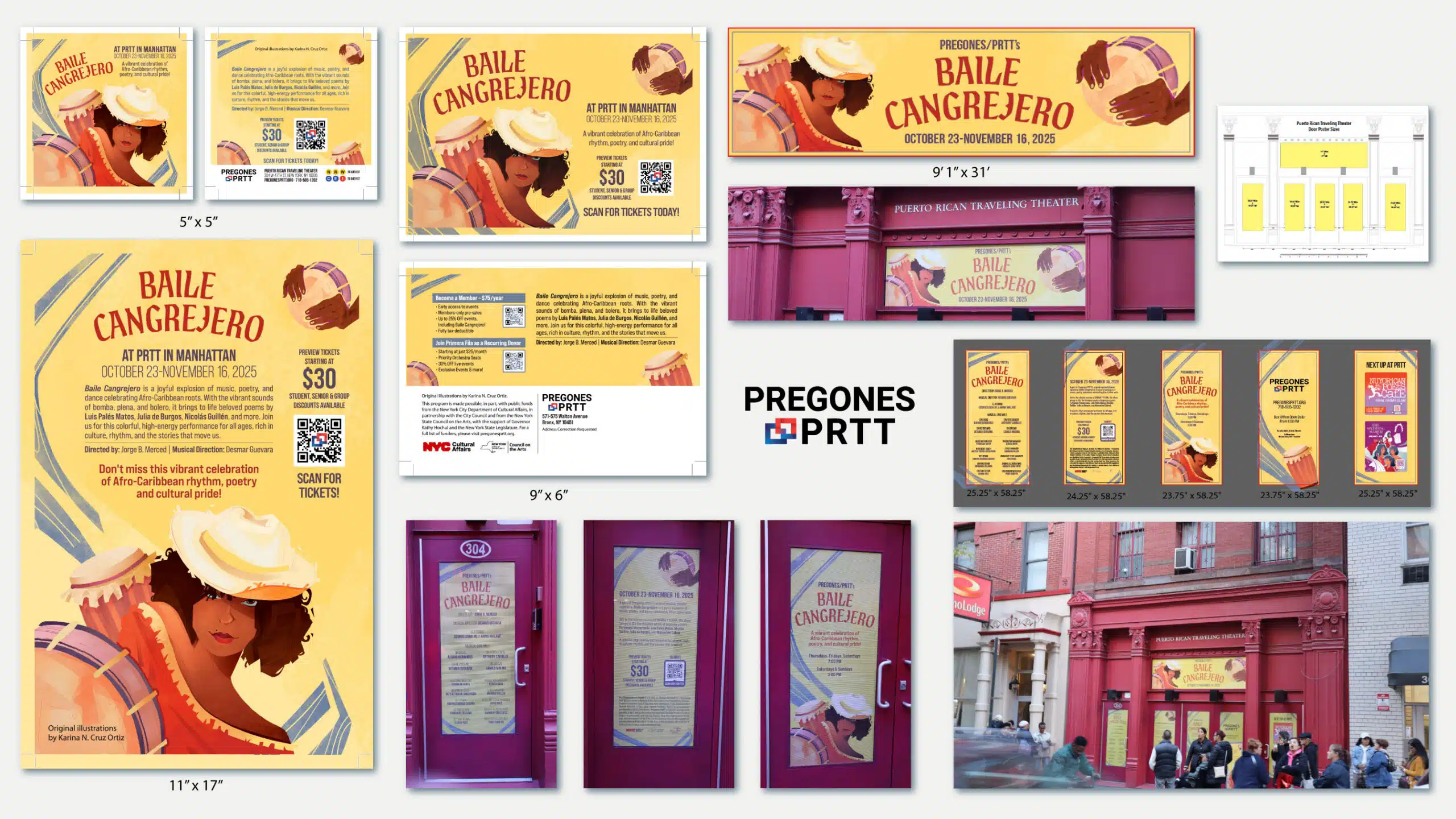
We took each production’s key art and set it into finished posters. These anchored the campaign and set the look that every other piece followed.
We laid the show’s artwork into direct mail that went straight to patrons, carrying the production into people’s homes.
We adapted the artwork into newspaper ads, sized and set for print placement while keeping the production’s look.
We scaled the artwork up into large-format graphics for the theater’s space, keeping it sharp at size.
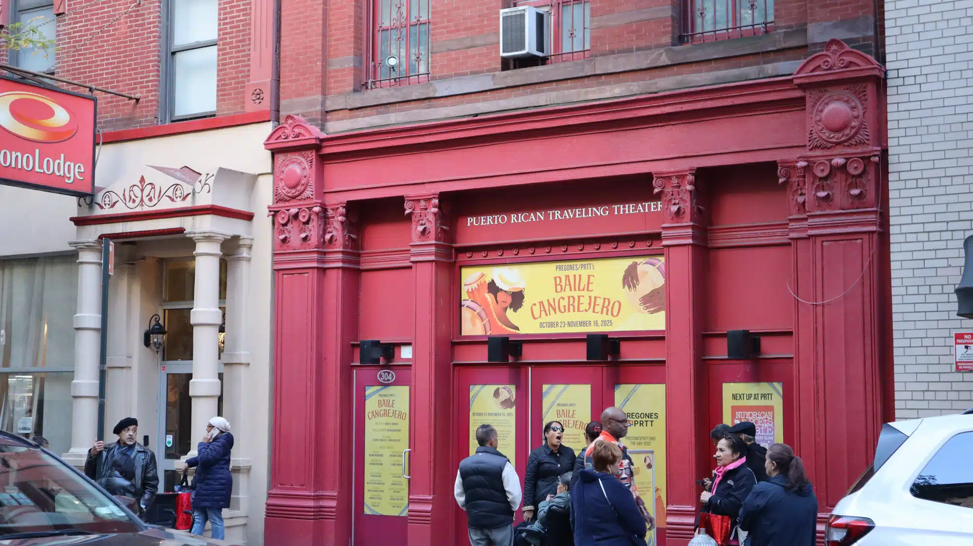
We adapted the artwork into window graphics installed across the storefront, turning the entrance into part of the campaign.
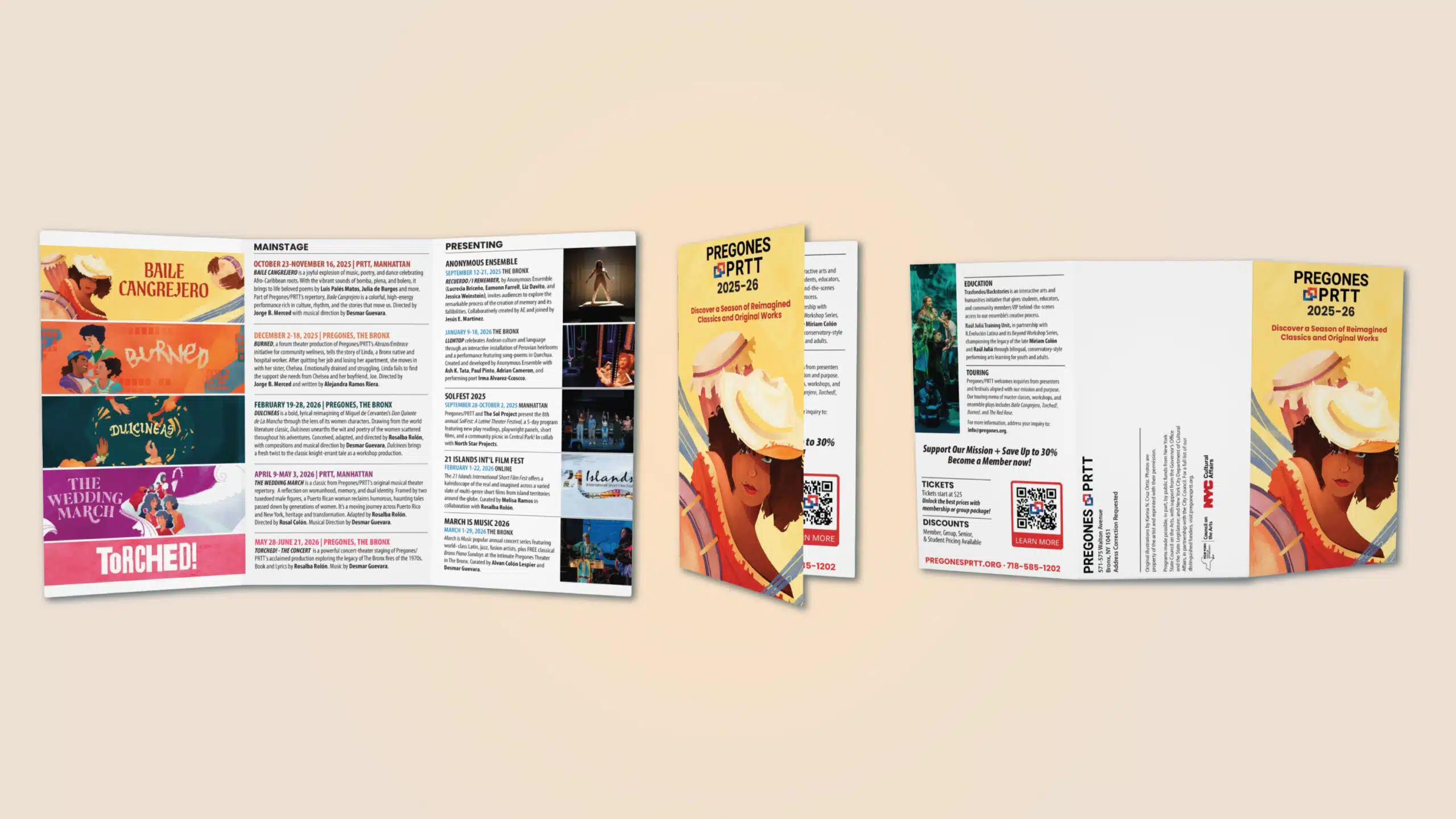
We arranged the season’s productions into trifold brochures, one printed guide to the year.
Across multiple productions, the theater print design held one consistent look. Whether a show reached audiences by mail, in the newspaper, or on the front of the building, it read as the same theater, and the print looked professional every time.
Baile Cangrejero shows what that looked like in practice. Working from the show’s own artwork, we designed its full run of print, mailed it to thousands of households, and saw strong engagement with the QR codes on those pieces.
“Working with Astound Media is allowing my nonprofit to tap into a broader set of digital tools for visibility and engagement. Jorge is a keen listener with a knack for problem-solving, synthesizing complex info, and keeping the work fun. A+”
Got questions? Ideas? Fill out the form below & our specialist will contact you.