
5 Reasons to Trust a Responsive WordPress Design Agency

Why Hire a Responsive WordPress Design Agency for Business Growth
With over 60% of web traffic now originating from mobile devices, having a responsive WordPress design is no longer optional—it’s essential for drawing in and keeping your audience engaged.
The Reign of Mobile Web Traffic
Mobile devices are now the primary source of web traffic, underscoring the critical need for responsive design. This trend demands that websites fluidly adjust to various screen sizes, ensuring a seamless user experience and heightened engagement.
This data highlights the imperative for responsive design to accommodate the majority of users accessing sites via mobile devices.
In this article, we delve into the essence of responsive WordPress design, its technical workings, and the substantial business benefits it offers—enhanced user experience, SEO improvements, conversion boosts, cost savings, and future-readiness. You’ll also learn about the expertise and services a specialized agency provides, transparent pricing considerations, Astound Media’s bespoke approach to responsive development, and answers to common queries small businesses have about responsive WordPress agencies. By the end, you’ll see why partnering with a dedicated responsive WordPress design agency is a savvy investment for sustained digital success.
Understanding Responsive WordPress Design and Its Mechanics
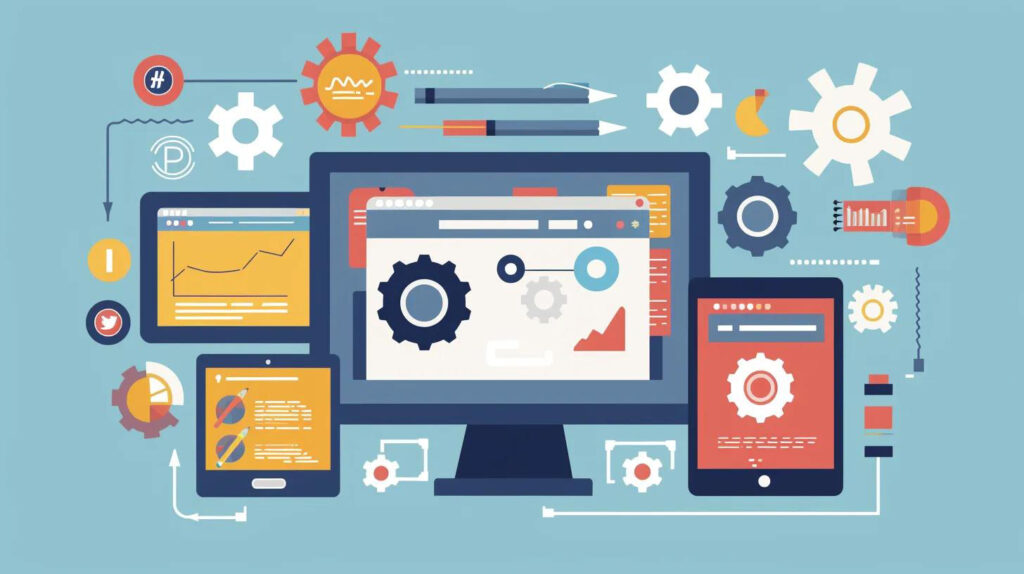
Responsive WordPress design involves crafting themes and templates that automatically adjust layout, imagery, and typography to the user’s device, ensuring optimal readability and interaction. This method uses fluid grids, flexible media, and CSS breakpoints to provide a consistent experience across smartphones, tablets, and desktops. For businesses, responsive design means a unified codebase, simplified maintenance, and consistent branding across all screens, paving the way for enhanced engagement and SEO performance.
The Impact of Responsive Web Design on WordPress Sites
For WordPress websites, responsive design means creating page templates that adjust site components—menus, sidebars, content blocks—based on screen size and orientation. It uses relative units (percentages, ems) instead of fixed pixels, allowing elements to resize proportionally. By embedding responsive features directly into a WordPress theme or page builder, developers ensure content flows seamlessly across devices, maintaining design integrity for mobile visitors and reducing bounce rates while increasing session durations.
The Role of Media Queries and Flexible Grids in Responsiveness
To grasp the mechanics behind responsive layouts, consider these key technologies:
- Media Queries set CSS rules that apply only within specified viewport ranges.
- Fluid Grids allocate column widths in percentages, allowing grid elements to expand or contract dynamically.
- Flexible Images and Videos use CSS properties like max-width: 100% to scale media without distortion.
These techniques work together to detect device characteristics and adjust the presentation layer, laying the groundwork for the performance and accessibility benefits that follow in SEO and UX.
Core Principles of Responsive Web Design
Responsive web design ensures a seamless user experience across all devices by adapting layouts and content. Here are its fundamental components:
These techniques work together to detect device characteristics and adjust the presentation layer, laying the groundwork for the performance and accessibility benefits that follow in SEO and UX.
Why WordPress is Perfect for Responsive Design
WordPress shines in responsive development due to its:
- Theme Ecosystem: Thousands of frameworks (e.g., Genesis, Astra) are built with mobile-first breakpoints.
- Page Builders: Tools like Elementor and Gutenberg offer intuitive drag-and-drop responsiveness controls.
- Plugin Architecture: Extensions such as WP Rocket and Smush handle asset optimization and adaptive image delivery.
These native capabilities reduce development time, while WordPress’s CMS flexibility ensures content edits remain device-agnostic and future-ready.
The Advantages of Choosing a Responsive WordPress Website
Responsive WordPress design offers tangible returns across user experience, search visibility, conversions, cost, and longevity. By adopting a single, adaptable site structure, small businesses and non-profits alike benefit from consistent branding, streamlined updates, and improved analytics. Let’s explore each advantage in detail.
Benefits of Responsive Design
Responsive design provides numerous benefits, including enhanced user experience, improved SEO, and increased conversion rates. By delivering a consistent experience across all devices, businesses can strengthen their online presence and achieve their marketing objectives more effectively.
This resource from Google offers insights into the core principles and benefits of responsive web design, aligning with the article’s emphasis on its importance.
Enhancing User Experience Across Devices with Responsive Design
Responsive layouts prioritize readability, easy navigation, and touch-friendly interactions on smartphones and tablets. Key UX improvements include:
- Adaptive Navigation that collapses menus into mobile-friendly toggles.
- Optimized Typography with relative font sizing for clear reading.
- Accessible Media that loads appropriately sized images to preserve bandwidth.
These enhancements reduce frustration, encourage longer sessions, and foster brand loyalty, translating directly into improved engagement metrics and customer satisfaction.
Boosting SEO and Google Rankings with Responsive Design

Responsive sites align with Google’s mobile-first indexing by serving the same content across all devices, eliminating duplicate URLs and consolidating link equity. Core SEO benefits include:
- Unified URL Structure prevents separate mobile site confusion.
- Faster Load Times through single-site optimization strategies.
- Improved Core Web Vitals by minimizing layout shifts and optimizing asset delivery.
These factors combine to boost search visibility, lower bounce rates, and drive higher organic traffic.
Increasing Conversions and Lead Generation with Responsive WordPress Design
By providing a frictionless, consistent experience on every device, responsive WordPress design reduces form abandonment and click-to-buy friction. Conversion-driving elements include:
- Mobile-Optimized Calls to Action with easy-tap buttons.
- Streamlined Contact Forms that adapt field layouts for small screens.
- Persistent Lead Magnets that display contextually relevant offers.
Businesses see an increase in newsletter sign-ups, quote requests, and sales as user flow becomes device-agnostic and conversion pathways remain clear.
The Cost-Effectiveness of Responsive Design Over Separate Mobile Sites
Before responsive design, many organizations maintained parallel desktop and mobile versions, doubling development and maintenance costs. In contrast, responsiveness offers:
These efficiencies free up budget for ongoing optimization and marketing activities, rather than repetitive technical upkeep.
Future-Proofing Your Website with Responsive Design
Responsive WordPress design adapts automatically to new device sizes, emerging form factors, and evolving web standards. By building on a flexible foundation of fluid grids and progressive enhancement, your site remains compatible with wearable displays, foldable screens, and emerging browsers—ensuring long-term relevance and reduced technical debt.
The Value of Hiring a Specialized Responsive WordPress Design Agency
Choosing an agency focused exclusively on responsive WordPress development ensures your project benefits from domain-specific expertise, process maturity, and strategic digital marketing integration. With responsive design now a baseline expectation, working with specialists elevates quality, reduces risk, and maximizes ROI.
Essential Expertise and Experience in a Responsive WordPress Agency
A top responsive WordPress agency brings demonstrated proficiency in:
- Custom Theme Development built on mobile-first frameworks.
- Performance Optimization, including caching, code minification, and image compression.
- UX/UI Best Practices for Cross-Device Interaction Design
- SEO and Analytics Integration for mobile indexing compliance.
Experience across diverse industries ensures that solutions balance aesthetic appeal, accessibility standards, and measurable business outcomes.
Custom Solutions and Scalability for Business Growth
Customized responsive themes and tailored plugins allow your WordPress site to grow alongside your organization. Key scalability advantages include:
- Modular Architecture that supports feature rollouts without site-wide rewrites.
- API Integrations for CRM, e-commerce, and marketing automation.
- Performance Budgeting to maintain speed as content libraries expand.
These custom solutions deliver long-term stability and empower your team to add functionality without compromising responsiveness.
Essential Ongoing Support and Maintenance Services
To sustain peak performance, specialized agencies provide:
- Security Updates for WordPress core, themes, and plugins.
- Performance Monitoring with routine audits of Core Web Vitals.
- Content and Feature Upgrades that maintain responsiveness with evolving requirements.
- Dedicated Support Channels ensuring rapid issue resolution and peace of mind.
These services keep your responsive WordPress website secure, fast, and aligned with best practices.
Integrating Design with Digital Marketing Strategies
A holistic responsive WordPress agency blends UX design with SEO, content strategy, and conversion rate optimization. Integration points include:
- SEO-Friendly Templates ensuring semantic HTML and proper meta markup.
- Lead Capture Workflows are embedded directly into mobile-optimized layouts.
- A/B Testing of responsive page variants to refine engagement.
- Analytics-Driven Design: Iterations that align design changes with measurable KPIs.
This strategic synergy accelerates lead generation and ensures your responsive site serves as a powerful marketing asset.
Factors Influencing the Cost of Responsive WordPress Design Services
Responsive WordPress pricing reflects project complexity, feature requirements, and ongoing support levels. Transparent understanding of these factors empowers businesses to plan and budget effectively before engaging an agency.
Project Elements Affecting Responsive WordPress Website Pricing
Below is an EAV overview of the principal cost drivers:
Typical Pricing Models for Responsive WordPress Agencies
Agencies commonly price responsive WordPress projects via:
- Fixed-Price Packages that define scope, deliverables, and timelines upfront.
- Hourly Rates for ongoing development and support typically range from $75–$150 per hour.
- Monthly Retainers combine maintenance, updates, and optimization services at predictable costs.
Choosing the right model depends on your project’s scale, desired flexibility, and long-term partnership goals.
Astound Media: Delivering Exceptional Responsive WordPress Design Services
“We build digital experiences that not only look stunning but also drive tangible business results.”
Jorge Leger, Founder of Astound Media, brings a wealth of experience in digital strategy and web development, with a strong focus on creating high-performing, user-centric online experiences. His background includes a deep understanding of how to leverage technology to drive business growth and achieve measurable results. Leger’s vision is to empower businesses with robust, responsive digital platforms that not only capture attention but also convert visitors into loyal customers.
Responsive WordPress Services Offered by Astound Media
We provide end-to-end responsive WordPress solutions, including:
- Custom theme creation based on mobile-first frameworks
- Performance and Core Web Vitals optimization
- UX/UI design tailored for cross-device engagement
- Plugin selection and custom development
- Integration with marketing automation and CRM
Explore our award-winning WordPress development services to see how we blend design and performance for measurable growth.
Client Success Stories Showcasing Astound Media’s Expertise
Our portfolio includes responsive WordPress projects that delivered:
- 25% increase in mobile conversions for a regional non-profit
- 40% reduction in page load time for an e-commerce startup
- 35% uplift in organic search traffic for a small business blog
These examples reflect our commitment to combining responsive design with clear business outcomes and trust-building performance.
Ready to Elevate Your Online Presence?
Let’s build a responsive WordPress website that drives results and captivates your audience across all devices.
Frequently Asked Questions About Responsive WordPress Design Agencies
Why is responsive design so crucial for WordPress websites today?
Responsive design is no longer a luxury but a fundamental necessity for WordPress websites. With the vast majority of internet users accessing content via mobile devices, a responsive site ensures that your content, navigation, and calls to action are perfectly optimized for every screen size. This adaptability directly impacts user experience, leading to lower bounce rates, increased engagement, and ultimately, higher conversion rates. For WordPress, which powers a significant portion of the web, embracing responsive design is key to maintaining competitiveness and reaching a broad audience effectively. It ensures that whether a user is on a desktop, tablet, or smartphone, they receive a consistent, high-quality experience that reflects positively on your brand.
What exactly constitutes a responsive WordPress theme?
A responsive WordPress theme is meticulously built with a mobile-first approach, incorporating flexible grid layouts, fluid image scaling, and CSS media queries. These elements work in concert to detect the user’s screen dimensions and automatically adjust the website’s layout, content presentation, and interactive elements accordingly. This means menus might collapse into a hamburger icon on smaller screens, sidebars could stack below the main content, and images resize without distortion. The goal is to provide an optimal viewing and interaction experience, regardless of the device being used, ensuring that your WordPress site remains accessible and user-friendly across the entire spectrum of devices.
Does WordPress inherently support responsive design features?
Yes, modern versions of WordPress come with built-in support for responsive design. The core WordPress software is designed to be responsive, and many of the default themes that ship with WordPress (like Twenty Twenty-Four, Twenty Twenty-Three, etc.) are fully responsive out of the box. These themes utilize mobile-first principles, fluid grids, and media queries to adapt to different screen sizes. Furthermore, the block editor (Gutenberg) and popular page builder plugins offer intuitive controls that allow users to customize layouts and styles for various devices, making it easier than ever to create responsive experiences within the WordPress ecosystem without extensive custom coding.
How should I go about evaluating a responsive WordPress design agency?
When evaluating a responsive WordPress design agency, several key factors should be considered. Start by thoroughly reviewing their portfolio, paying close attention to the mobile performance and user experience of the sites they’ve developed. Look for evidence of expertise in modern CSS frameworks and mobile-first development methodologies. Case studies that detail conversion outcomes and SEO improvements are invaluable. It’s also crucial to inquire about their process, their understanding of your specific industry, and their approach to ongoing support and maintenance. Don’t hesitate to ask for client testimonials or references to gauge their reliability and client satisfaction. A strong agency will demonstrate a clear understanding of how responsive design integrates with broader digital marketing goals.
What are the primary benefits of engaging a specialized responsive WordPress development agency?
Hiring a specialized responsive WordPress development agency offers distinct advantages over general web designers or DIY solutions. These specialists possess deep expertise in mobile-first frameworks, ensuring your site is built with optimal performance and scalability from the ground up. They excel at performance tuning, integrating advanced SEO strategies for mobile indexing, and crafting intuitive UX/UI designs tailored for cross-device interaction. Moreover, they provide dedicated ongoing support and maintenance, keeping your site secure, up-to-date, and aligned with the latest web standards. This specialized knowledge translates into a future-proof website that is not only visually appealing but also a powerful engine for business growth, maximizing your return on investment.
Responsive WordPress design is essential for creating a unified digital presence that engages users, pleases search engines, and drives conversions. By partnering with a specialized agency like Astound Media, you gain technical mastery, strategic marketing integration, and transparent pricing—ensuring your WordPress site remains fast, flexible, and fully equipped for tomorrow’s devices. Reach out today to secure your responsive advantage.
