How a Responsive WordPress Design Agency Elevates Your Brand

How a Responsive WordPress Design Agency Elevates Your Brand

Responsive WordPress Design Agency Benefits for Businesses: Why Your Business Needs a Mobile-Optimized Website

In today’s digital landscape, over half of all web traffic comes from mobile devices like smartphones and tablets. Yet, many WordPress sites still struggle with clunky layouts and sluggish load times on these platforms. This disconnect frustrates users, increases bounce rates, and hampers search engine visibility. A responsive WordPress design agency ensures your site seamlessly adapts to any screen, enhancing user engagement, boosting SEO rankings, driving conversions, and cutting costs. In this guide, we’ll dive into what responsive WordPress design is, its impact on UX, SEO, and conversion optimization, and why teaming up with a pro agency like Astound Media is your ticket to a future-proof online presence.

“In the digital age, a responsive website isn’t just a feature; it’s the foundation of a successful online presence. It ensures that every visitor, regardless of their device, has a seamless and engaging experience, which is paramount for building trust and driving business growth.” – Jorge Leger, Founder and Digital Marketing Consultant, Astound Media.

Mobile Web Traffic Dominance

With more than half of global web traffic now coming from mobile devices, optimizing for mobile is no longer optional—it’s essential. Responsive design ensures your website performs flawlessly across all devices, meeting the needs of the ever-growing mobile audience.

– Statista, Mobile share of website traffic worldwide from 2015 to 2024 (2025)

This statistic highlights the critical need for responsive design to accommodate the increasing number of users accessing websites on mobile devices.

What Is Responsive WordPress Design and Why Is It Essential for Businesses?

Close-up of a smartphone showing a well-optimized website layout, illustrating responsive design

Responsive WordPress design is all about creating a single website layout that automatically adjusts to different screen sizes, ensuring a top-notch viewing experience on desktops, tablets, and smartphones. By leveraging fluid grids, flexible images, and CSS media queries, responsive design keeps your brand consistent and user-friendly across devices—a must for businesses targeting mobile audiences and aligning with Google’s mobile-first indexing.

Google’s Mobile-First Indexing

Google now prioritizes the mobile version of websites for indexing and ranking, making responsive design a crucial component of SEO. A single responsive URL ensures consistent content and metadata across devices, enhancing search engine optimization.

– Google Search Central, Mobile-first indexing (2024)

This information underscores the importance of responsive design in aligning with Google’s indexing practices for improved search visibility.

How Does Responsive Design Adapt WordPress Websites Across Devices?

Responsive design employs adaptable CSS rules and fluid grid systems to detect screen width and reorganize page elements accordingly.

  • Flexible Grid: Percentage-based column widths adjust content blocks to fit various viewport sizes.
  • Media Queries: CSS breakpoints apply different styling rules for small, medium, and large devices.
  • Scalable Media: Images and videos resize or switch source files to optimize load times.

These mechanisms ensure legible text, tappable buttons, and appropriately sized visuals on any device, preventing users from pinching, zooming, or abandoning the page due to poor layout.

Why Choose WordPress for Responsive Website Development?

WordPress powers over 43 percent of all websites, offering:

  • A vast ecosystem of mobile-friendly themes and responsive frameworks.
  • Plugins that optimize images, lazy-load assets, and manage caching automatically.
  • A user-friendly content management interface that scales from blogs to enterprise sites.

These advantages, combined with WordPress’s open-source extensibility, make it an ideal CMS for crafting and maintaining responsive experiences without starting from scratch on every device.

What Are the Key Features of a Responsive WordPress Design Agency?

A specialized agency offers end-to-end services, including planning, design, development, and ongoing optimization. Key features include:

  • Mobile Usability Audits – Comprehensive analysis of your existing site’s performance across devices.
  • Custom Theme Development – Building child themes or bespoke templates that adhere to responsive best practices.
  • Performance Optimization – Image compression, code minification, and CDN integration to accelerate load times.
  • Cross-Browser Testing – Ensuring compatibility on iOS, Android, Windows, and desktop environments.
  • Ongoing Maintenance – Regular updates, security patches, and responsive tweaks as new devices emerge.
EntityAttributeValue
Mobile Usability AuditsScopeScreen resolutions, touch targets, and readability
Custom Theme DevelopmentDeliverableResponsive templates, cross-device prototypes
Performance OptimizationTechniquesLazy loading, CSS/JS minification, image format conversion
Cross-Browser TestingPlatformsChrome, Safari, Firefox, Edge on desktop and mobile
Ongoing MaintenanceFrequencyMonthly updates, quarterly UX reviews

These capabilities define an agency’s ability to deliver a seamless, future-proof WordPress experience that scales with your audience.

How Does Responsive WordPress Design Enhance User Experience for Businesses?

User interacting with a responsive website on a tablet in a cozy coffee shop, highlighting user experience

Responsive WordPress design elevates user interactions by delivering layouts and content that feel native to each device, reducing friction in every step of the user journey.

What UX Improvements Result from Responsive WordPress Design?

Responsive sites eliminate the need for horizontal scrolling and pinch-to-zoom, providing:

  • Intuitive Navigation: Menus adapt to collapsible formats on smaller screens.
  • Readable Typography: Font sizes and line heights adjust for clarity on mobile.
  • Thumb-Friendly Buttons: Touch targets exceed 44×44 pixels, improving tap accuracy.

These enhancements foster longer sessions, higher page views, and a feeling of professionalism that builds trust and encourages further exploration.

How Does Responsive Design Improve Accessibility and Visual Appeal?

By following WCAG guidelines in combination with responsive layouts, businesses gain:

  • Contrast and Legibility: Adaptive color schemes maintain sufficient contrast on any screen.
  • Flexible Media Scaling: Images switch to higher or lower resolutions based on device capabilities.
  • Logical Content Flow: Linear stacking on mobile ensures that users read content in a natural order.

Accessible, visually appealing interfaces demonstrate inclusivity and strengthen brand perception while accommodating users with visual impairments or assistive technologies.

Why Is Seamless Navigation Critical for Business Websites?

Seamless navigation guides visitors to key information—products, services, contact forms—without confusion or delay.

When menus collapse into well-labeled icons, breadcrumbs adjust to screen width, and search bars remain accessible, users can find what they need quickly. This fluid journey directly correlates with higher engagement metrics, which signal relevance and quality to search engines.

What SEO Benefits Do Businesses Gain from Responsive WordPress Design?

A responsive WordPress site consolidates SEO signals and aligns with Google’s mobile-first indexing, making it a strategic investment for organic visibility.

How Does Responsive Design Align with Google’s Mobile-First Indexing?

Google now primarily crawls and indexes the mobile version of websites. A single responsive URL means:

  • All content and metadata remain consistent across desktop and mobile crawls.
  • Link equity and social shares converge onto one address, avoiding split rankings.
  • Structured data, such as Schema.org markup, applies uniformly without duplication issues.

This alignment ensures search engines view your site as optimized for modern user behavior, boosting crawl efficiency and ranking potential.

Why Does Responsive WordPress Design Reduce Bounce Rates and Increase Dwell Time?

When visitors arrive on a mobile-optimized page that renders quickly and displays content clearly, they stay longer and explore more pages. Reduced frustration leads to lower bounce rates, while increased time on site signals to search engines that your content meets user intent—factors that contribute to higher SEO authority.

How Does Responsive Design Improve WordPress Site Speed and Core Web Vitals?

Responsive techniques such as image srcset, preloading critical assets, and deferring offscreen scripts directly improve Core Web Vitals metrics (Largest Contentful Paint, First Input Delay, Cumulative Layout Shift). Faster load times not only satisfy users but also meet Google’s performance thresholds, ranking faster sites more favorably in search results.

How Can Responsive WordPress Design Boost Conversion Rates and Lead Generation?

By delivering a consistent brand experience and clear calls to action on every device, responsive design strengthens trust and persuades visitors to convert.

What Role Does Consistent Branding Play in Conversion Optimization?

Maintaining uniform colors, typography, and imagery across devices fosters brand recognition and credibility. When users see the same look and feel on mobile, tablet, and desktop, they feel confident that your business is professional and reliable, essential traits for successful lead generation.

How Do Optimized Call-to-Actions Work on Responsive WordPress Sites?

Responsive call-to-action buttons adjust size, color contrast, and placement to remain prominent on all screen sizes. Best practices include:

  • Placing CTAs above the fold on mobile without obscuring content.
  • Using concise, action-oriented copy like “Get a Free Quote” or “Download Now.”
  • Ensuring buttons span a full-width container on small screens for easy tapping.

These optimizations drive higher click-through rates and form submissions, directly impacting revenue.

Why Is Responsive Design Important for E-commerce Businesses?

For online stores, every millisecond of delay or layout glitch can translate to cart abandonment. Responsive product galleries, adaptive checkout forms, and mobile wallets integration ensure shoppers can browse, select, and purchase with confidence, delivering a frictionless path from product discovery to transaction.

What Are the Cost-Effectiveness and ROI Advantages of Hiring a Responsive WordPress Design Agency?

illustration showing person sitting at desk working on the computer, a dollar sign in the background, and a stack of gold coins representing ROI from web design

Investing in a single responsive site reduces development and maintenance costs compared to separate desktop and mobile versions, while delivering significant returns in traffic, engagement, and conversions.

How Does Single Site Management Reduce Maintenance Costs?

Maintaining one codebase cuts update efforts in half. Rather than applying security patches and theme updates to multiple sites, you update a single installation. This unified approach minimizes developer time and lowers ongoing expenses.

EntityAttributeValue
Separate Mobile SiteMaintenance FrequencyMonthly per site
Responsive Single SiteMaintenance FrequencyMonthly unified update
Development CostInitial Setup2× to 3× higher for two sites vs. one
Total Cost of OwnershipYear One30 percent lower with a responsive approach

Unified management translates into budget freed for marketing initiatives or additional feature development, demonstrating a clear return on investment.

Why Is Responsive Design a Future-Proof Solution for Business Growth?

As new devices and screen formats emerge, foldables, wearables, and beyond, a responsive framework automatically accommodates uncommon viewports without requiring full rebuilds. This adaptability protects your digital investment and ensures your site remains compatible with tomorrow’s technology.

How Can Businesses Measure the ROI of Responsive WordPress Design?

ROI can be tracked through:

  • Organic Traffic Growth: Monitor mobile versus desktop sessions in Google Analytics.
  • Conversion Rate Uplift: Compare form submissions or e-commerce transactions before and after redesign.
  • Bounce Rate Reduction: Analyze session metrics to quantify engagement improvements.
  • Time on Page Increases: Document average session duration changes as UX improves.

These metrics provide concrete evidence that responsive design drives business outcomes.

Why Partner with a Responsive WordPress Design Agency Like Astound Media?

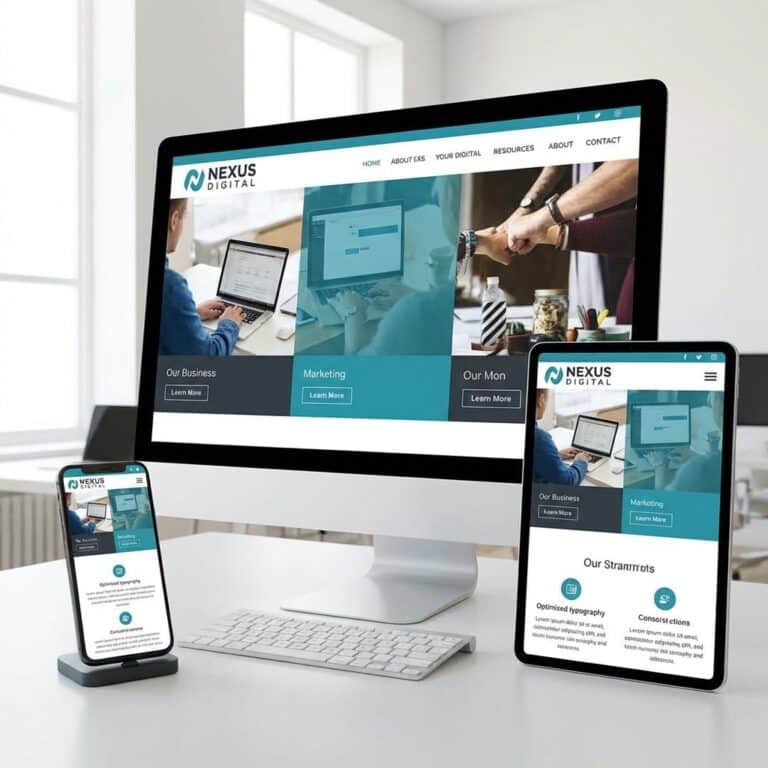
image showing an illustration of multiple device screens (mobile, tablet, laptop, and desktop) representing responsive website design

Astound Media combines deep WordPress expertise, a results-driven development process, and ongoing support to deliver responsive sites that align with your strategic objectives.

What Specialized Expertise Does Astound Media Offer in Responsive WordPress Design?

Our team applies a proven methodology that includes:

  • Custom responsive theme development using Bootstrap and Tailwind CSS.
  • Performance tuning with advanced caching, CDN integration, and image optimization.
  • SEO-driven structure with Schema.org markup, XML sitemaps, and mobile-first best practices.

This end-to-end expertise ensures your site not only looks great on every device but also performs at peak levels in search.

How Does Astound Media Provide Tailored Solutions and Ongoing Support?

We start with a detailed discovery phase to map your business goals and user personas, then craft a custom solution that matches your brand identity. After launch, our maintenance plans include:

  • Monthly updates and security audits.
  • Quarterly UX reviews and performance audits.
  • Priority support and iterative enhancements as your business evolves.

This commitment to continuous improvement keeps your site aligned with emerging trends and technologies.

What Success Stories Demonstrate Astound Media’s Impact on Business Growth?

Client case studies highlight measurable gains:

ClientChallengeResult
Non-Profit OrganizationPoor mobile engagement75 percent increase in mobile donations
B2B Services FirmSlow load times on mobile50 percent faster LCP, 30 percent more leads
E-commerce RetailerHigh mobile cart abandonment20 percent lift in mobile checkout rate

These outcomes illustrate how a responsive redesign can transform user experiences into tangible revenue and engagement lifts.

What Are the Most Common Questions About Responsive WordPress Design?

What Are the Key Benefits of Responsive WordPress Design for Businesses?

Responsive WordPress design delivers unified branding, improved SEO performance through mobile-first indexing, and enhanced user experience that reduces bounce rates, optimized conversion paths, and lower maintenance costs by managing a single adaptive site.

How Does Responsive Design Impact SEO for WordPress Websites?

By using one URL for all devices, responsive design consolidates link equity, aligns with Google’s mobile-first indexing, improves site speed and Core Web Vitals, and lowers bounce rates—factors that collectively elevate rankings in search engine results pages.

Why Should Small Businesses Invest in Responsive WordPress Development?

Small businesses capture growing mobile audiences, improve accessibility for all users, boost engagement metrics that influence search visibility, and enjoy a cost-effective, future-proof solution that scales with evolving digital trends.

Engage with Astound Media’s WordPress experts to transform your online presence with a responsive, mobile-optimized website built for performance and growth. To explore our services, check out our WordPress solutions, or contact us today.

About the Author

Jorge Leger is the Founder and Digital Strategist & Marketing Consultant behind Astound Media, a New York–based agency helping organizations grow through smart, scalable web design and marketing. With over a decade of experience in WordPress development, SEO, and marketing automation, Jorge partners with mission-driven teams to deliver high-performing websites and campaigns that drive real results. He brings a sharp eye for strategy and a deep understanding of what it takes to stand out online—especially for small businesses and nonprofit organizations. When he’s not leading projects or optimizing digital funnels, you’ll find him exploring ways to make technology more accessible and impactful for growing teams. Connect with Jorge on LinkedIn.

Jorge Leger
Jorge Leger
Jorge Leger helps small businesses and nonprofits cut through the digital noise with strategies that are practical and results-driven. From unpacking the latest Google updates to testing new WordPress features, his goal is simple: make digital growth accessible, sustainable, and impactful. He shares insights on WordPress, SEO, Email Marketing, Advertising, Content Marketing, Social Media, UX Design, and the Tools & Resources SMBs need to grow with confidence.